
PRODUCT DESIGN / REDESIGN / UX / UI
Redesign of self- appointment kiosk

OVERVIEW
Nowadays every region in Russia has its own online service for booking appointments to see a doctor. Some of them are very popular among patients and others are not.
The main goal of redesign was to make our online service more popular and useful. This process included the following tasks:
1. Uncover causes of low users engagement and improve it
2. Make visual design more modern and attractive
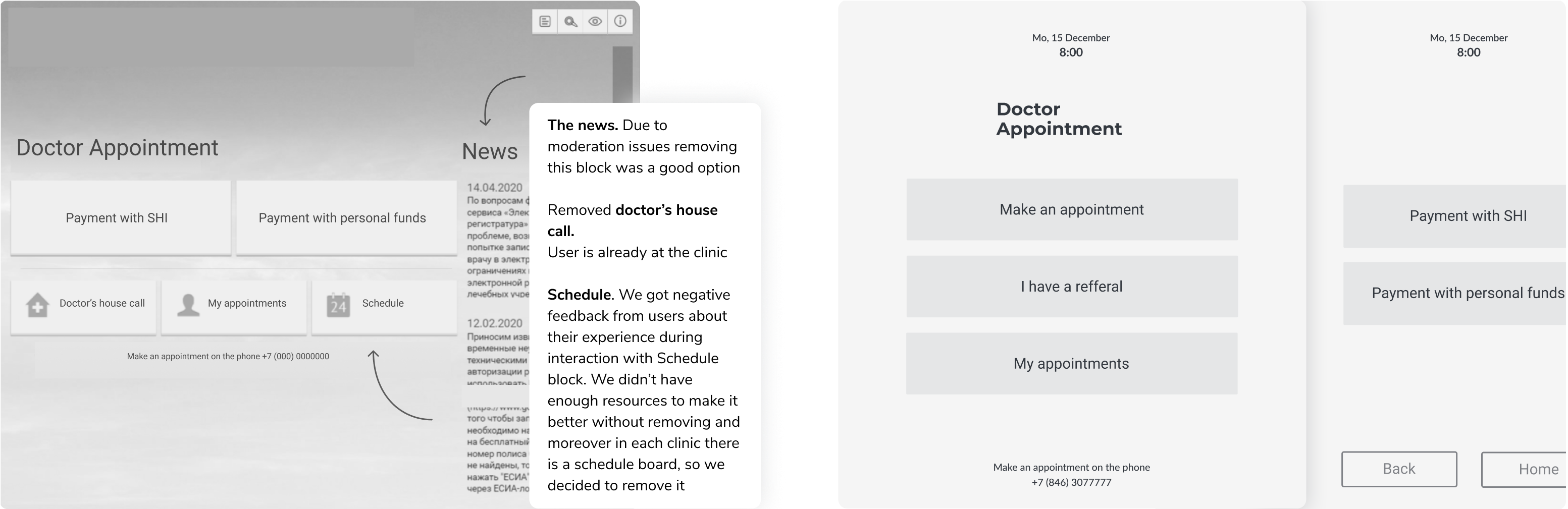
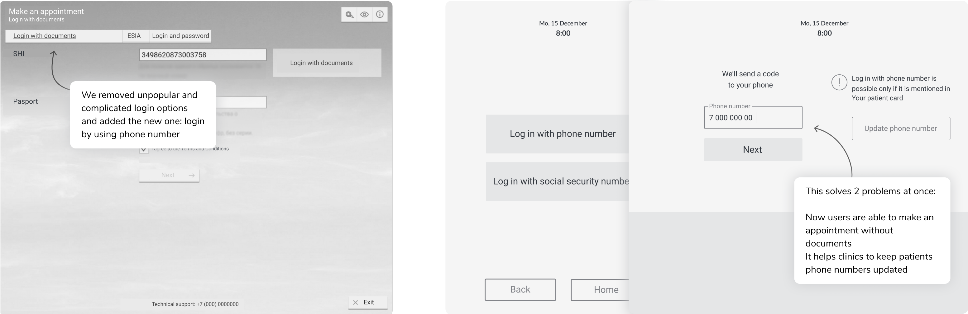
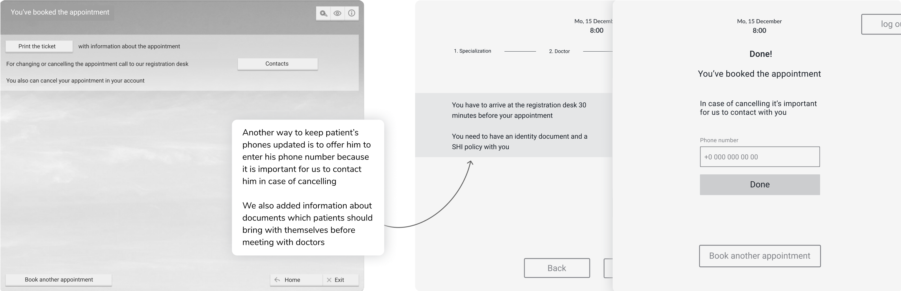
3. Help clinics to keep patients phone numbers updated
ROLE
Product Designer, UX researcher
User Research, Interaction, Visual Design, Prototyping & Testing
Understanding the problem & the process
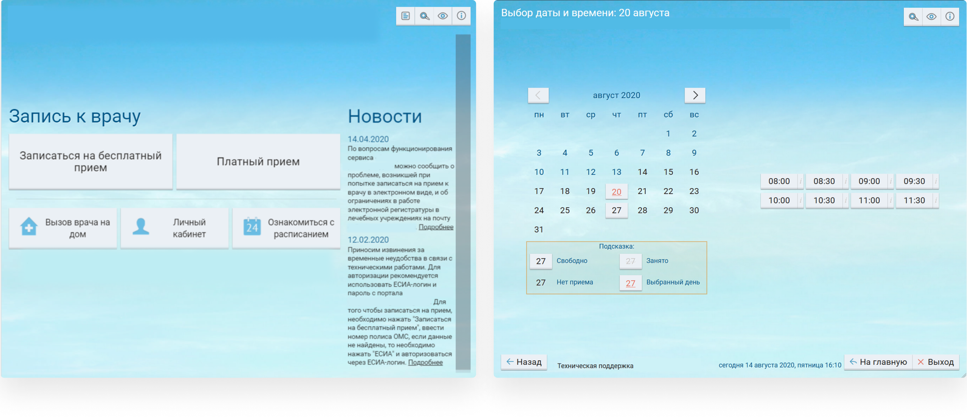
Original design of our service is similar for both devices: desktop and kiosk. Our first decision was to separate it into two different versions, because when our users are at home – they may need different features than when they are at a clinic.
After that we visited clinics with our kiosks and cunducted field studies. We also interviewed clinic stuff to uncover their pain points when working with our kiosks.
Then I created a CJM and drew wireframes with gathered insights. We showed it our stakeholders and tested it on users from different age groups.
After getting positive feedback we started to work on the visual design.
My research encompassed:
- Uncovering users pain points with using CJM
- Field studies
- Personas and user interview
- Feedback from clinic stuff
- Competitor analysys
Customer Journey map
Our CJM with hypotheses for improving which are marked with blue colour.
For the first iteration we chose the easiest hypotheses for development.

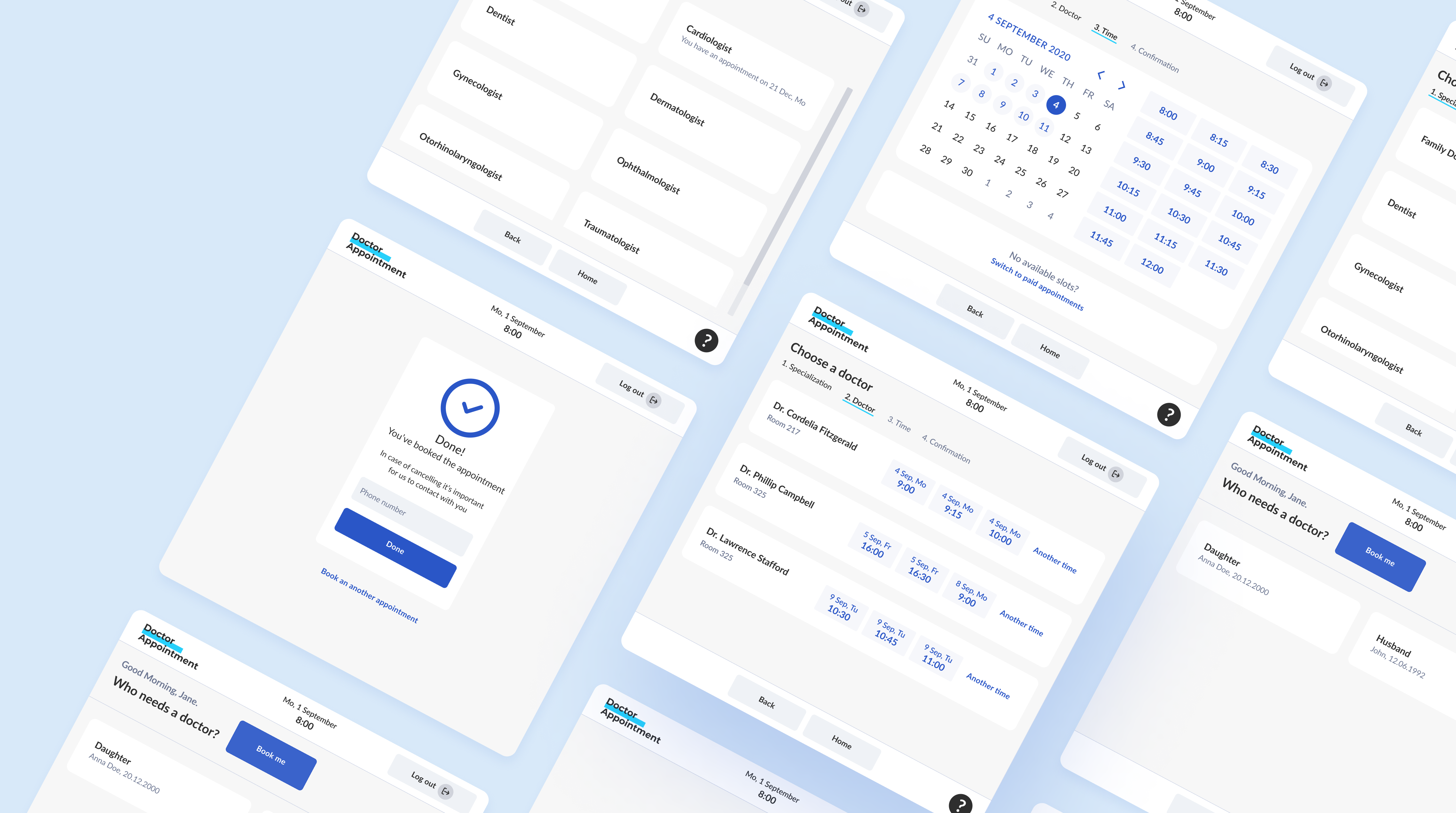
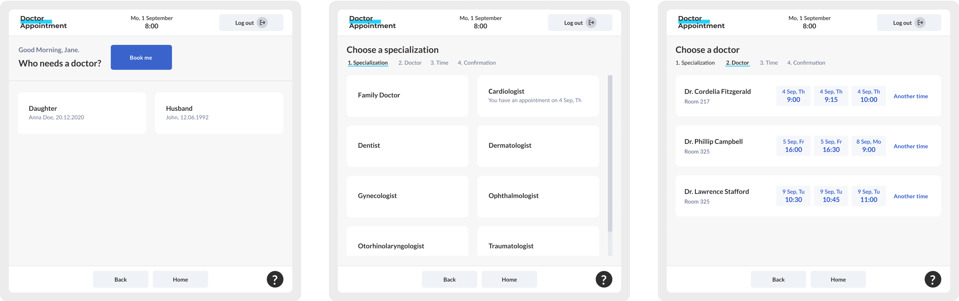
Some examples of UX redesign
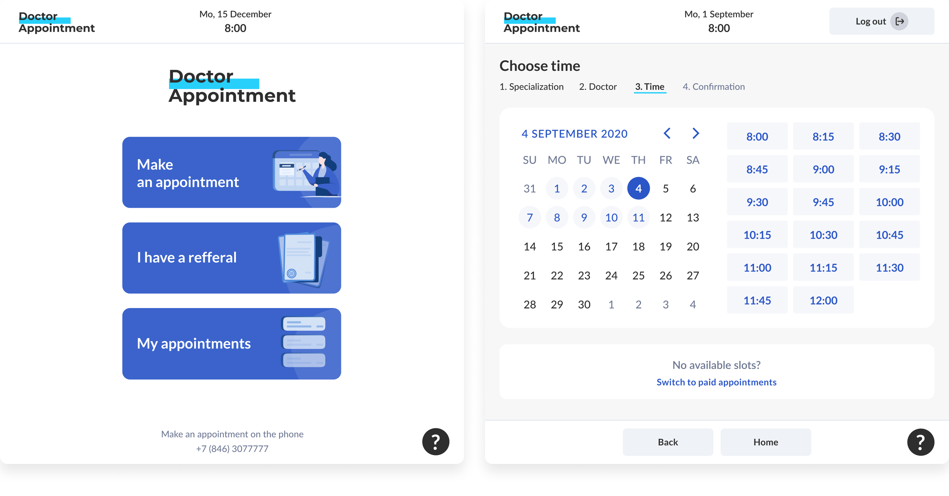
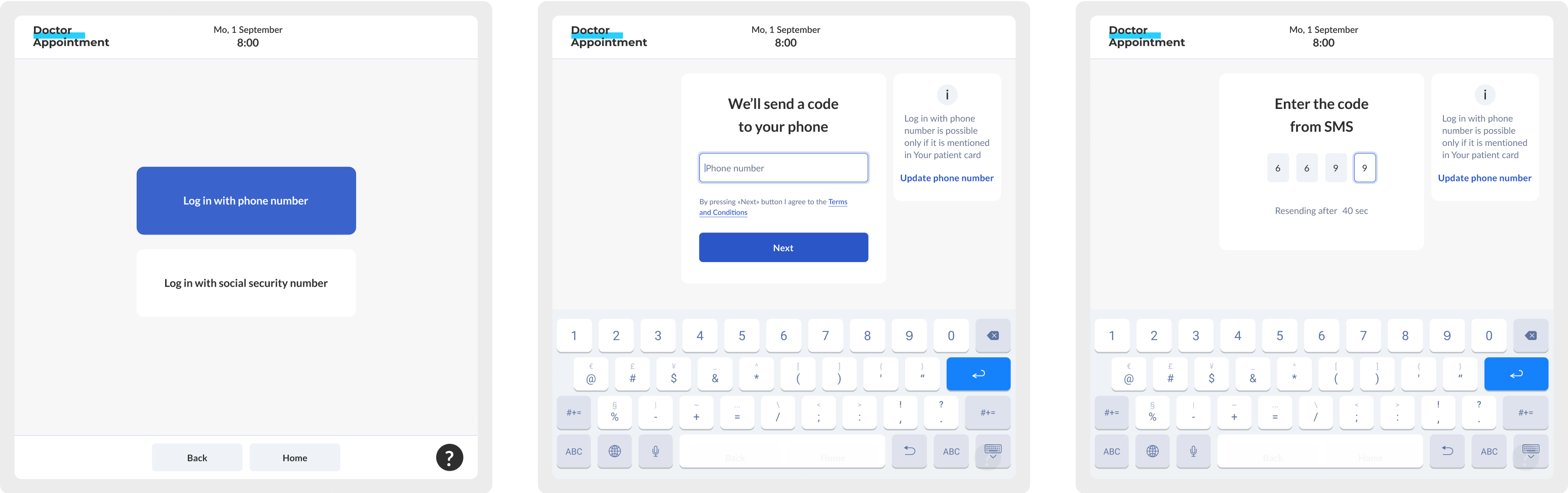
We put hypotheses from the previous step on wireframes.
Here you can see some UX changes for the main user flow: make an appointment.
Before redesign
After redesign

Results and Metrics
We created the clickable prototype, tested it on potential users and presented to stakeholders.
These metrics below also can help to evaluate the success of our redesign. They are expected to increase:
- A share of appointments made using our
- A number of patients cards with specified phone number